
Introduction
Aapki website par traffic aana important hai, lekin us traffic ko leads ya customers mein convert karna usse bhi zyada important hai. Isi conversion process ka sabse important element hota hai CTA (Call-to-Action) Button.
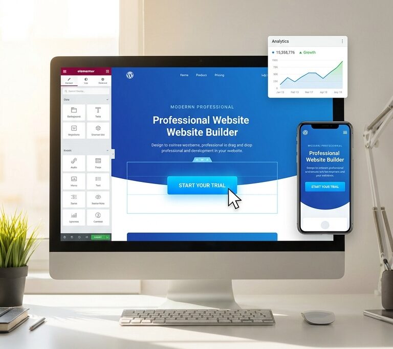
Agar aap WordPress aur Elementor use karte hain, to ek well-designed CTA button visitors ko action lene ke liye motivate kar sakta hai. Chahe aap contact form submit karwana chahte ho, product sell karna chahte ho, ya newsletter signup badhana chahte ho, CTA button aapki website ka conversion engine hota hai.
2026 mein Google user experience, helpful content aur engagement signals ko pehle se zyada importance de raha hai. Isliye sirf attractive CTA button banana kaafi nahi hai, uska placement, design aur wording bhi matter karti hai.
Is guide mein hum Elementor CTA buttons ke baare mein detail mein jaanenge aur best practices discuss karenge jo aapki website ki conversions improve kar sakti hain.
What Is a CTA Button?
CTA ka full form hai Call-to-Action.
Ye ek clickable button hota hai jo users ko specific action lene ke liye encourage karta hai.
Examples:
- Contact Us
- Get Started
- Download Now
- Learn More
- Book a Call
- Subscribe Now
- Buy Now
CTA button ka primary purpose visitors ko next step tak guide karna hota hai.
Agar website par CTA hi nahi hoga to visitors confuse ho sakte hain aur bina action liye website chhod sakte hain.
Why CTA Buttons Matter for Website Conversions
CTA button website ke sabse important conversion elements mein se ek hai.
1. User Direction Provide Karta Hai
Users ko pata chal jata hai ki next step kya hai.
2. Lead Generation Increase Karta Hai
Contact forms aur inquiry pages par CTA buttons leads generate karne mein help karte hain.
3. Sales Improve Karta Hai
E-commerce websites par effective CTA buttons sales badha sakte hain.
4. User Experience Better Banata Hai
Clear navigation aur action points website ko user-friendly banate hain.
5. Bounce Rate Reduce Kar Sakta Hai
Jab users ko clear direction milti hai to wo website par zyada engage karte hain.
How to Add a CTA Button in Elementor
Elementor mein CTA button add karna bahut simple hai.
Step 1
WordPress Dashboard open karein.
Step 2
Page ko Elementor Editor mein open karein.
Step 3
Left panel se Button Widget drag and drop karein.
Step 4
Button text enter karein.
Example:
- Get Started
- Contact Us
- Book Consultation
Step 5
Link add karein.
Aap button ko:
- Contact Page
- Phone Call
- Landing Page
- Contact Form
se connect kar sakte hain.
Step 6
Style tab mein jaakar customize karein.
Best CTA Button Design Practices
Google aur UX experts dono recommend karte hain ki CTA button easily visible aur clickable hona chahiye.
Use High Contrast Colors
CTA button background se alag dikhna chahiye.
Example:
- White background + Blue Button
- Dark background + Orange Button
- Light background + Green Button
Contrast users ki attention attract karta hai.
Keep Button Size Appropriate
Button itna chhota na ho ki users miss kar dein.
Aur itna bada bhi na ho ki spammy lage.
Ideal button size mobile aur desktop dono par clearly visible hona chahiye.
Add Enough White Space
Button ke aas-paas space hona chahiye.
Crowded design CTA performance ko reduce kar sakta hai.
Use Rounded Corners
Modern websites mein rounded buttons zyada professional lagte hain.
Elementor mein border radius easily customize ki ja sakti hai.
Hover Effects Add Karein
Hover animation user interaction ko improve karti hai.
Examples:
- Color Change
- Grow Effect
- Shadow Effect
- Underline Animation
Best CTA Button Text Examples
Button text directly conversion rates ko impact karta hai.
Good CTA Examples
✅ Get Started
✅ Contact Us
✅ Book a Free Call
✅ Download Guide
✅ Start Learning
✅ Join Now
✅ Request Quote
✅ Try for Free
Avoid Generic Text
❌ Click Here
❌ Submit
❌ Enter
❌ Press Here
Action-oriented text zyada effective hota hai.
CTA Button Placement Best Practices
Placement design se bhi zyada important ho sakta hai.
Hero Section
Hero section website ka first visible area hota hai.
Yahan CTA button add karna recommended hai.
Example:
Headline
Subheadline
[Get Started Button]
Services Section
Har service description ke niche CTA add karein.
Example:
Web Design Service
[Request Quote]
Contact Section
Page ke bottom par CTA button hona chahiye.
Example:
Need Help?
[Contact Us]
Landing Pages
Landing page par multiple strategic CTA buttons use kiye ja sakte hain.
Lekin overuse avoid karein.
Mobile Optimization for CTA Buttons
2026 mein mobile-first design bahut important hai.
Google bhi mobile experience ko priority deta hai.
Mobile CTA Tips
- Minimum 44px height
- Easy thumb access
- Readable text
- Fast loading
- Proper spacing
Mobile users ko accidental clicks se bachana bhi important hai.
CTA Button SEO Best Practices
CTA button directly SEO ranking factor nahi hai.
Lekin indirectly SEO ko impact kar sakta hai.
Better User Engagement
Strong CTA visitors ko website par longer time spend karne ke liye encourage karta hai.
Improved Conversions
Higher engagement website quality signals improve kar sakti hai.
Better Navigation
Google user-friendly websites ko prefer karta hai.
Accessibility
Buttons accessible hone chahiye.
Include:
- Clear text
- Proper contrast
- Keyboard navigation support
Common CTA Button Mistakes
Too Many CTA Buttons
Ek page par bahut saare competing CTA buttons users ko confuse kar sakte hain.
Poor Color Choice
Background ke same color ka button invisible lag sakta hai.
Weak Button Text
“Click Here” jaise text conversion reduce kar sakte hain.
No Mobile Testing
Desktop par perfect button mobile par broken lag sakta hai.
Wrong Placement
Important CTA fold ke niche hide nahi hona chahiye.
CTA Button Ideas for Different Websites
Freelancer Website
- Hire Me
- Request Quote
- Book a Call
Business Website
- Contact Sales
- Schedule Consultation
- Get Pricing
Blog Website
- Read More
- Subscribe Now
- Download Guide
Course Website
- Enroll Now
- Start Learning
- Join Course
Portfolio Website
- View Projects
- Work With Me
- Contact Me
Elementor CTA Button Styling Tips
Agar aap Elementor use kar rahe hain to ye styling options helpful ho sakte hain.
Typography
- Bold Font
- Easy-to-read Size
- Proper Letter Spacing
Border Radius
- 10px to 30px modern look ke liye
Box Shadow
Light shadow button ko highlight karti hai.
Icon Integration
Examples:
- Arrow Icon
- WhatsApp Icon
- Phone Icon
- Download Icon
Icons button visibility improve kar sakte hain.
CTA Button Conversion Optimization Tips
Use Urgency
Examples:
- Start Today
- Limited Offer
- Book Now
Create Value
Instead of:
“Submit”
Use:
“Get Free Consultation”
Reduce Friction
Short aur simple actions zyada conversions laate hain.
A/B Testing
Different button colors aur texts test karein.
Example:
Version A: Get Started
Version B: Start Free Today
Phir results compare karein.
Future of CTA Buttons in 2026
Modern websites increasingly focus on:
- Mobile-first design
- Accessibility
- User experience
- Fast loading
- Personalized CTAs
Google bhi helpful aur user-focused experiences ko reward karta hai.
Isliye CTA button sirf design element nahi balki conversion strategy ka important part hai.
Conclusion
CTA Button Elementor websites ka sabse powerful conversion tool ho sakta hai. Ek effective CTA button users ko action lene ke liye guide karta hai, lead generation improve karta hai aur overall website performance ko better banata hai.
Agar aap Elementor use karte hain to focus karein:
✔ Clear Button Text
✔ High Contrast Design
✔ Strategic Placement
✔ Mobile Optimization
✔ Fast Loading Experience
✔ User-Friendly Design
Jab design aur user intent dono align hote hain, tab CTA buttons website conversions ko significantly improve kar sakte hain.