
Website par contact form lagana enough nahi hota. Agar users form fill karne ke baad submit button par click hi nahi karte, to aap valuable leads aur inquiries miss kar sakte hain. Isi liye Contact Form Submit Button Style website design aur conversion optimization ka ek important part hai.
2026 mein Google user experience (UX), accessibility, mobile usability aur engagement-focused design ko zyada importance de raha hai. Ek well-designed submit button users ko action lene ke liye motivate karta hai aur form completion rate improve kar sakta hai.
Is guide mein hum contact form submit button styling ke best practices, design trends, color psychology aur WordPress customization methods ko detail mein samjhenge.
Why Contact Form Submit Button Style Matters
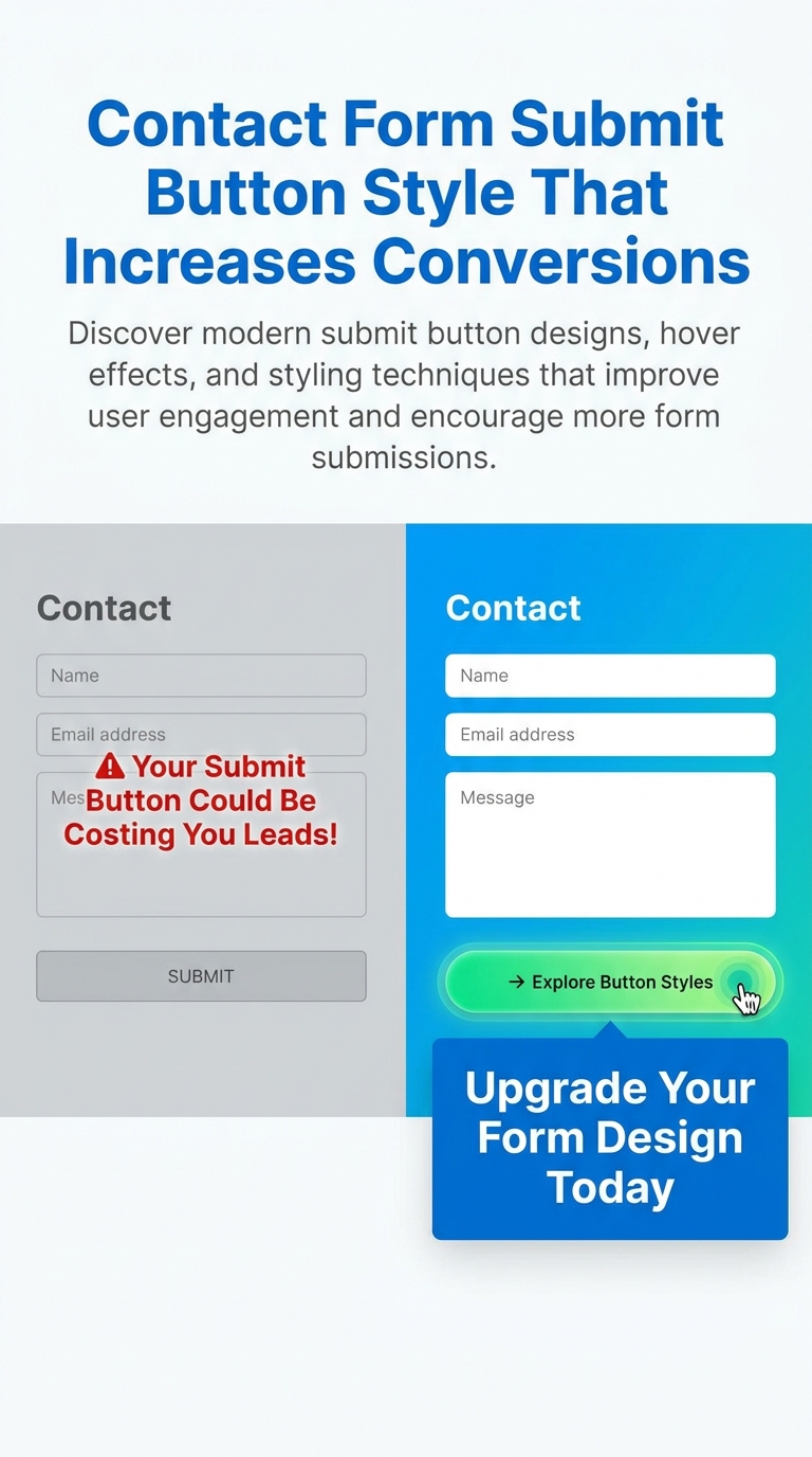
Contact form ka submit button user journey ka final step hota hai.
Agar button attractive, visible aur easy-to-click nahi hai, to users form complete karne ke baad bhi action nahi lete.
Ek effective submit button:
- Lead generation improve karta hai
- Form abandonment reduce karta hai
- Better user experience provide karta hai
- Mobile usability enhance karta hai
- Website professionalism increase karta hai
Yahi reason hai ki successful websites submit button design par special attention deti hain.
What Makes a High-Converting Submit Button?
Har stylish button high-converting nahi hota.
Ek effective submit button mein ye qualities honi chahiye:
Clear Visibility
Button page ke background se easily distinguish hona chahiye.
Agar website white background use karti hai to button ka color contrast create karna zaroori hai.
Good examples:
- Blue button with white text
- Green button with white text
- Orange CTA button
Action-Oriented Text
Sirf “Submit” likhna har situation mein best option nahi hota.
Better CTA examples:
- Send Message
- Get Free Quote
- Request Callback
- Book Consultation
- Start Free Trial
- Download Now
Specific CTA users ko next action samajhne mein help karta hai.
Proper Button Size
Button na bahut chhota hona chahiye aur na hi unnecessarily bada.
Recommended size:
- Height: 45px–60px
- Padding: 12px–20px
Large touch-friendly buttons mobile users ke liye helpful hote hain.
Mobile Responsiveness
Aaj majority traffic mobile devices se aata hai.
Submit button:
- Easily tappable hona chahiye
- Screen width ke according adjust hona chahiye
- Text readable hona chahiye
Best Contact Form Submit Button Styles
Ab dekhte hain kuch popular submit button styles jo modern websites mein use kiye ja rahe hain.
1. Solid Color Submit Button
Ye sabse common aur effective style hai.
Benefits:
- Clean design
- Fast loading
- Professional appearance
Best for:
- Business websites
- Agency websites
- Service websites
2. Rounded Submit Button
Rounded corners button ko modern aur friendly appearance dete hain.
Advantages:
- Better aesthetics
- Modern UI feel
- Improved visual appeal
Popular border radius:
- 8px
- 20px
- 50px
3. Gradient Submit Button
Gradient buttons premium look create karte hain.
Popular combinations:
- Purple → Pink
- Blue → Cyan
- Orange → Red
Benefits:
- Eye-catching design
- Modern appearance
- Higher visual engagement
4. Outline Submit Button
Minimal websites ke liye outline buttons perfect choice hote hain.
Features:
- Transparent background
- Colored border
- Elegant appearance
Best for:
- Portfolio websites
- Creative agencies
- Minimal layouts
5. Full Width Submit Button
Mobile forms mein full-width buttons kaafi effective hote hain.
Advantages:
- Better visibility
- Easy tapping
- Improved mobile experience
Particularly landing pages ke liye useful hote hain.
6. Shadow Effect Button
Shadow button ko depth aur prominence provide karta hai.
Benefits:
- Premium appearance
- Better focus
- Modern design
Soft shadows harsh shadows se better perform karte hain.
7. Hover Animation Button
Hover effects user interaction improve karte hain.
Popular hover effects:
- Background color change
- Slight scaling
- Shadow enhancement
- Border transition
Ye effects user ko button clickable hone ka signal dete hain.
8. Icon Submit Button
Button text ke saath icon add karna bhi effective strategy hai.
Examples:
- Send Message →
- Get Quote 📩
- Contact Us ➜
Icons CTA ko visually appealing bana dete hain.
Best Colors for Contact Form Submit Buttons
Color psychology conversion rates ko impact kar sakti hai.
Blue
Blue trust aur professionalism represent karta hai.
Best for:
- Corporate websites
- Consultants
- Agencies
Green
Green success aur positive action ko represent karta hai.
Best for:
- Service businesses
- Booking forms
- Lead forms
Orange
Orange urgency aur attention create karta hai.
Best for:
- Marketing campaigns
- Lead generation pages
Black
Black premium aur modern appearance deta hai.
Best for:
- Luxury brands
- Creative websites
Red
Red action-oriented color hai.
Use carefully because excessive red aggressive feel kara sakta hai.
How to Style Submit Button in Elementor
Elementor users bina coding ke button customize kar sakte hain.
Step 1
Form Widget select karein.
Step 2
Style Tab open karein.
Step 3
Submit Button section par click karein.
Step 4
Customize:
- Background Color
- Text Color
- Typography
- Border Radius
- Padding
- Hover Effects
Step 5
Update button click karein.
Contact Form 7 Submit Button Styling
Contact Form 7 users CSS ke through button customize kar sakte hain.
Modern Blue Button
.wpcf7-submit{
background:#2563eb;
color:#fff;
padding:14px 30px;
border:none;
border-radius:8px;
cursor:pointer;
}
Hover Effect
.wpcf7-submit:hover{
background:#1d4ed8;
}
Rounded Button
.wpcf7-submit{
border-radius:50px;
}
Accessibility Tips for Submit Buttons
Google accessibility ko important ranking factor ke roop mein indirectly support karta hai.
Use High Contrast Colors
Button text aur background clearly visible hone chahiye.
Good Example:
- White text
- Dark blue background
Maintain Readable Font Size
Recommended:
- Minimum 16px
Avoid Generic Labels
Instead of:
- Submit
- Click Here
Use:
- Send Message
- Get Free Consultation
Keyboard Accessibility
Button keyboard navigation ke through accessible hona chahiye.
Common Submit Button Design Mistakes
Using Low Contrast Colors
Users button identify nahi kar pate.
Tiny Buttons
Small buttons mobile users ke liye frustrating hote hain.
Too Many Animations
Excessive animations distractions create karti hain.
Poor Mobile Optimization
Mobile-first design aaj mandatory hai.
Generic CTA Text
Action-oriented text better conversions generate karta hai.
Contact Form Submit Button Trends in 2026
2026 mein ye trends popular hain:
Minimal Design
Simple aur clutter-free buttons.
Rounded Corners
Modern and friendly appearance.
Soft Shadows
Subtle depth effects.
Micro Animations
Smooth hover interactions.
Mobile-First Design
Touch-friendly layouts.
Accessibility-Focused Design
Readable aur user-friendly buttons.
How Submit Button Design Affects SEO
Directly submit button ranking factor nahi hai.
Lekin indirectly impact karta hai:
- Better user experience
- Lower bounce rate
- Higher engagement
- Improved conversions
- Better mobile usability
Ye sab website performance ko improve karne mein help karte hain.
Conclusion
Contact Form Submit Button Style ek small design element lag sakta hai, lekin iska impact website conversions aur lead generation par bahut bada hota hai.
2026 mein successful websites sirf attractive buttons nahi banati balki user-friendly, accessible aur mobile-responsive CTA buttons create karti hain.
Agar aap WordPress, Elementor ya Contact Form 7 use kar rahe hain, to proper color selection, action-oriented text, hover effects aur responsive design ke saath submit button optimize karke form submissions significantly increase kar sakte hain.
Ek simple rule yaad rakhein:
“Jitna clear aur clickable aapka submit button hoga, utni hi zyada chances honge ki visitors leads mein convert hon.”