
Introduction
Jab bhi hum kisi website ko visit karte hain, sabse pehle jo cheez hume notice hoti hai wo sirf colors ya images nahi hote, balki website par likha hua content aur uska presentation hota hai. Isi presentation ko web design ki language me Typography kaha jata hai.
Agar aap WordPress aur Elementor use karte hain, to typography aapki website ke user experience, readability aur SEO par direct impact daalti hai. Ek achhi typography visitors ko content padhne ke liye encourage karti hai, jabki poor typography users ko website chhodne par majboor kar sakti hai.
Is guide me main Elementor ke andar typography settings, font selection, heading hierarchy aur best practices ko explain karungi jo maine apni learning aur website design practice ke dauran observe kiya hai.
Website Typography Kya Hoti Hai?
Typography ka matlab hai website par text ko visually present karne ka tarika.
Isme include hota hai:
- Font Family
- Font Size
- Font Weight
- Line Height
- Letter Spacing
- Text Alignment
- Heading Structure
Simple words me typography decide karti hai ki aapki website professional lagegi ya amateur.
Elementor Me Typography Kyu Important Hai?
Elementor users ke liye typography sirf design ka part nahi hai.
Ye help karti hai:
Better Readability
Agar text easily readable hoga to visitors zyada time website par spend karenge.
Improved User Experience
Clear headings aur proper spacing content ko scan karna easy banati hai.
Professional Appearance
Professional typography website ki credibility increase karti hai.
SEO Benefits
Google user experience ko importance deta hai. Readable content indirectly SEO performance ko support karta hai.
Typography Ke Main Elements
1. Font Family
Font family website ka overall personality define karti hai.
Popular options:
- Roboto
- Poppins
- Inter
- Open Sans
- Montserrat
Beginners ke liye Poppins aur Inter ka combination kaafi effective hota hai.
2. Font Size
Different sections ke liye different sizes use karne chahiye.
Suggested Sizes:
H1 Heading
40px – 60px
H2 Heading
32px – 40px
H3 Heading
24px – 30px
Paragraph Text
16px – 18px
3. Font Weight
Font weight text ki thickness ko control karta hai.
Common values:
- 300 – Light
- 400 – Regular
- 500 – Medium
- 600 – Semi Bold
- 700 – Bold
4. Line Height
Line height readability improve karti hai.
Paragraphs ke liye:
1.5 – 1.8 line height generally best mana jata hai.
5. Letter Spacing
Letters ke beech ka gap letter spacing kehlata hai.
Excessive spacing readability ko reduce kar sakti hai.
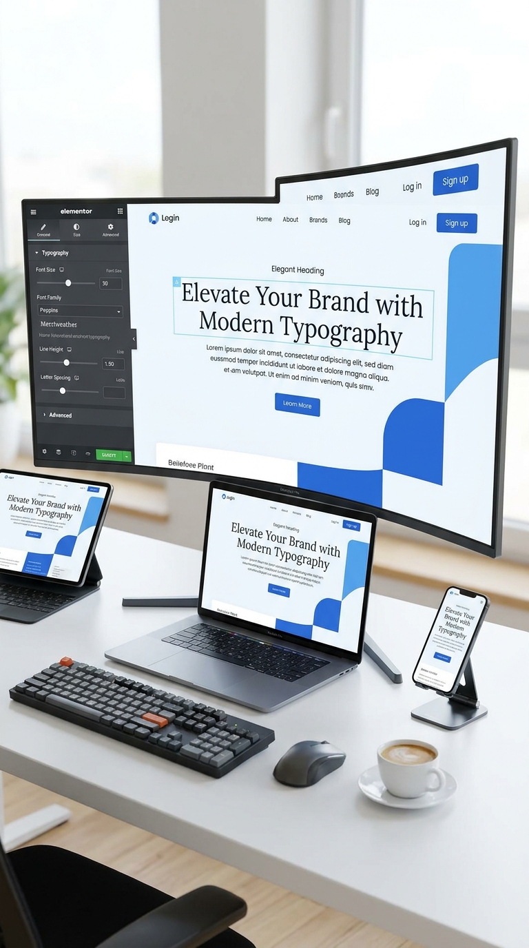
Elementor Me Typography Settings Kaise Access Karein?
Maine Elementor Free Version use karke typography settings explore ki hain.
Steps:
- Elementor Editor open karein.
- Kisi Heading ya Text Widget par click karein.
- Style Tab open karein.
- Typography option select karein.
- Font Family, Size, Weight aur Line Height customize karein.
Is process ko desktop aur mobile dono views me test karna chahiye.
Global Fonts Kya Hote Hain?
Elementor me Global Fonts ek useful feature hai jo website ki consistency maintain karne me help karta hai.
Agar aap har page par alag fonts use karenge to website inconsistent lagegi.
Global Fonts use karne se:
- Same design maintain hota hai.
- Editing easy hoti hai.
- Brand identity strong banti hai.
Heading Hierarchy Ka Importance
Website par heading structure bahut important hota hai.
Example:
H1
Main Page Title
H2
Major Sections
H3
Sub Sections
H4
Supporting Information
Ek page par sirf ek H1 use karna generally recommended hota hai.
Typography Aur Mobile Responsiveness
Aaj majority traffic mobile devices se aata hai.
Desktop par perfect lagne wali typography mobile par problematic ho sakti hai.
Mobile Best Practices
- Heading sizes reduce karein.
- Line height optimize karein.
- Paragraphs ko readable rakhein.
- Long text blocks avoid karein.
Elementor responsive mode ka use karke mobile typography test karna zaroori hai.
Font Pairing Kya Hoti Hai?
Font pairing ka matlab hai do complementary fonts ka use.
Example:
Combination 1
Heading:
Poppins
Body:
Open Sans
Combination 2
Heading:
Montserrat
Body:
Roboto
Combination 3
Heading:
Inter
Body:
Inter
Beginners ko initially ek ya do fonts tak hi limited rehna chahiye.
Common Typography Mistakes
Learning phase me maine kuch common mistakes notice ki:
Too Many Fonts
3–4 fonts use karne se design inconsistent lag sakta hai.
Very Small Text
14px se kam paragraph text readability reduce kar sakta hai.
Excessive Bold Text
Har heading ko bold banana hierarchy ko weak karta hai.
Poor Contrast
Light gray text on white background readability ko affect karta hai.
Ignoring Mobile View
Typography ko mobile devices par check karna zaroori hai.
Typography Aur Brand Identity
Typography website branding ka important part hai.
Agar aap:
- Freelancer hain
- Agency owner hain
- Blogger hain
To typography aapki brand personality represent karti hai.
Professional typography visitors ke trust ko improve karti hai.
My Experience While Learning Typography in Elementor
Jab maine Elementor me website sections design karne start kiye, tab mujhe laga ki fonts choose karna simple task hai.
Lekin practical testing ke baad mujhe samajh aaya ki:
- Proper font size readability improve karta hai.
- Consistent typography website ko professional banati hai.
- Mobile typography desktop se equally important hai.
- Heading hierarchy content structure ko better banati hai.
Website design me typography ek small detail lag sakti hai, lekin overall user experience par iska impact bahut bada hota hai.
Best Typography Checklist
Website publish karne se pehle:
- Use maximum 2 fonts.
- Maintain heading hierarchy.
- Paragraph size 16–18px rakhein.
- Mobile view test karein.
- Global fonts setup karein.
- Proper line height use karein.
- Readability check karein.
- Contrast verify karein.
Frequently Asked Questions
Elementor Me Best Font Kaunsa Hai?
Poppins, Inter, Roboto aur Open Sans beginners ke liye popular options hain.
Kya Multiple Fonts Use Karne Chahiye?
Generally 2 fonts se zyada use karna avoid karna chahiye.
Mobile Typography Important Hai?
Haan. Mobile traffic ko dhyan me rakhte hue typography optimize karna bahut important hai.
Kya Typography SEO Ko Affect Karti Hai?
Direct ranking factor nahi hai, lekin readability aur user experience improve karke SEO performance ko support kar sakti hai.
Conclusion
Typography kisi bhi website design ka foundation hoti hai. Elementor users ke liye proper font selection, heading hierarchy, line spacing aur responsive typography maintain karna bahut important hai.
Agar aap beginner hain to simple fonts, clear headings aur consistent styling se start karein. Jaise-jaise experience badhega, aap advanced typography techniques ko bhi implement kar sakenge.
Ek professional website sirf beautiful images se nahi, balki readable aur user-friendly typography se bhi banti hai.