
Introduction
Jab bhi koi visitor aapki website par aata hai, uska first impression sirf content ya images se nahi banta. Colors bhi user perception aur trust par direct impact daalte hain. Isi liye website design mein color palette selection ek bahut important step hota hai.
Bahut se beginners website banate waqt apne favorite colors choose kar lete hain. Lekin professional web design mein colors ko branding, user experience, readability aur accessibility ke according select kiya jata hai.
Ek well-planned color palette website ko professional, trustworthy aur visually appealing banati hai. Dusri taraf random colors website ko cluttered aur confusing bana sakte hain.
Is guide mein hum website ke liye color palette select karne ka complete process samjhenge, jisse aap apni brand identity ke according perfect colors choose kar sakein.
What Is a Color Palette?
Color palette ek predefined collection hoti hai jo website ke design mein use ki jati hai.
Generally ek website palette mein ye colors hote hain:
- Primary Color
- Secondary Color
- Accent Color
- Background Color
- Text Color
Ye colors milkar website ka visual identity system create karte hain.
Agar website mein har jagah different colors use kiye jayein to design inconsistent lagta hai. Color palette consistency maintain karti hai.

Why Color Palette Selection Matters
Website colors sirf decoration ke liye nahi hote.
Colors affect:
- User trust
- Brand recognition
- Readability
- Accessibility
- Conversion rate
- User experience
Research continuously show karti hai ki users first few seconds mein visual appearance ke basis par opinion bana lete hain.
Isi liye color selection strategic hona chahiye.
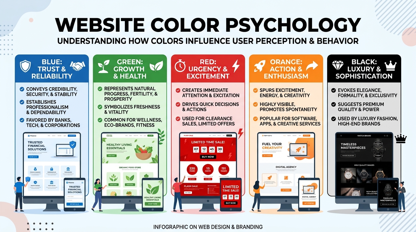
Understanding Color Psychology
Color psychology website design ka important part hai.
Different colors different emotions create karte hain.
Blue
Blue trust, stability aur professionalism ko represent karta hai.
Commonly used for:
- Corporate websites
- Technology companies
- Finance businesses
Examples:
- Banks
- SaaS companies
- Consulting websites
Green
Green growth, nature aur health ko represent karta hai.
Best for:
- Health websites
- Wellness brands
- Eco-friendly businesses
Red
Red urgency aur attention create karta hai.
Best use:
- Sale promotions
- CTA buttons
- Limited-time offers
Excessive use avoid karna chahiye.
Yellow
Yellow positivity aur energy ko represent karta hai.
Useful for:
- Creative brands
- Youth-focused businesses
Orange
Orange friendliness aur enthusiasm show karta hai.
Frequently used for:
- Startups
- Marketing brands
- Creative websites
Black
Black luxury aur sophistication represent karta hai.
Best for:
- Premium brands
- Fashion websites
- Luxury products
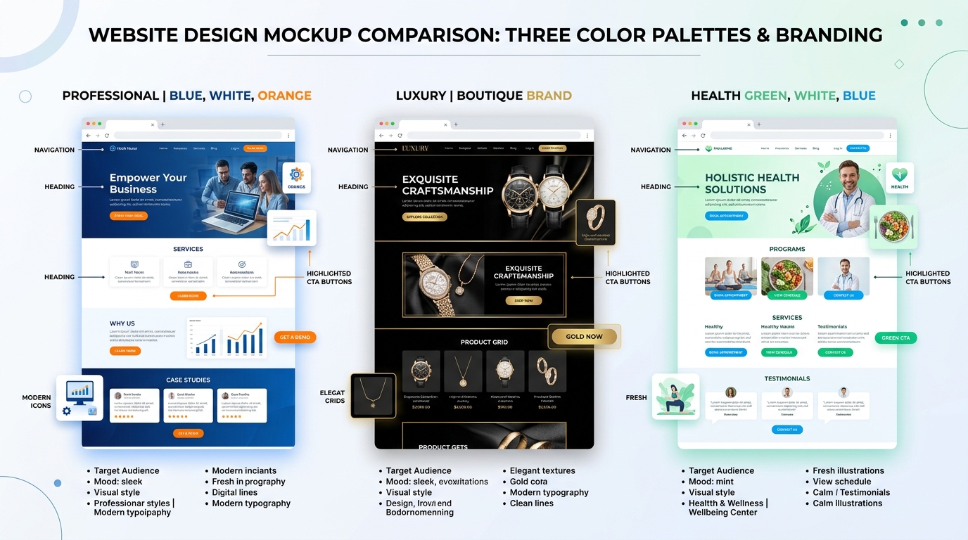
Start With Your Brand Identity
Color palette select karne se pehle apni brand identity define karein.
Khud se ye questions poochiye:
- Meri website kis audience ke liye hai?
- Brand serious hai ya creative?
- Professional hai ya friendly?
- Premium hai ya affordable?
Example:
Digital marketing website ke liye:
- Blue
- White
- Orange
ka combination effective ho sakta hai.
Luxury brand ke liye:
- Black
- Gold
- White
better choice ho sakti hai.
The 60-30-10 Rule
Professional designers often 60-30-10 rule use karte hain.
60% Primary Color
Main website background ya dominant visual area.
30% Secondary Color
Supporting sections aur visual hierarchy create karta hai.
10% Accent Color
Buttons aur important elements highlight karta hai.
Ye rule balanced design create karta hai.
Choose a Primary Color Carefully
Primary color website ka most visible color hota hai.
Ye color:
- Logo se match hona chahiye
- Brand personality represent karna chahiye
- Consistent use hona chahiye
Digital marketing websites ke liye blue commonly preferred choice hota hai.
Select Supporting Colors
Secondary colors primary color ko complement karte hain.
Supporting colors:
- Contrast create karte hain
- Layout organize karte hain
- Visual interest increase karte hain
Too many supporting colors avoid karein.
2-3 colors usually enough hote hain.
Focus on Accessibility
Website design sirf beautiful nahi balki accessible bhi hona chahiye.
Accessibility ensure karti hai ki:
- Low vision users content read kar sakein
- Color blindness users website use kar sakein
- Text clearly visible ho
Maintain Proper Contrast
Dark text on light background generally best readability provide karta hai.
Examples:
✔ Black text on white background
✔ Dark blue text on light gray background
Avoid:
❌ Light gray text on white background
❌ Yellow text on white background
Use Neutral Colors Wisely
Neutral colors foundation provide karte hain.
Examples:
- White
- Gray
- Off-white
- Beige
Benefits:
- Clean appearance
- Better readability
- Professional design
Most successful websites neutral backgrounds use karti hain.
Create Visual Hierarchy
Color hierarchy users ko guide karti hai.
Important elements:
- Buttons
- Forms
- Headlines
accent colors se highlight kiye jate hain.
Isse users easily understand karte hain ki next action kya lena hai.
Choosing CTA Colors
CTA (Call-to-Action) buttons website conversion ke liye important hote hain.
CTA color:
- Background se stand out karna chahiye
- Easily visible hona chahiye
- Consistent hona chahiye
Popular CTA colors:
- Orange
- Green
- Blue
- Red
Choice audience aur branding par depend karti hai.
Tools for Color Palette Selection
Professional color palette banane ke liye ye tools helpful hain:
Adobe Color
Custom palettes create karne ke liye.
Coolors
Quick palette generation.
Color Hunt
Trending color combinations.
Canva Color Palette Generator
Image-based palette suggestions.
Common Color Palette Mistakes
Too Many Colors
Excessive colors website ko cluttered bana dete hain.
Stick to 3–5 main colors.
Ignoring Accessibility
Poor contrast readability problems create karta hai.
Following Trends Blindly
Har trend har brand ke liye suitable nahi hota.
Brand identity ko priority dein.
Inconsistent Color Usage
Har page par different colors use karna branding ko weak karta hai.
Consistency maintain karein.
EEAT-Based Best Practices
Google EEAT framework ke according user experience aur trust important factors hain.
Color palette indirectly trust influence karti hai.
Best practices:
- Professional appearance maintain karein
- Consistent branding use karein
- Accessible design follow karein
- Readability prioritize karein
- User-friendly navigation support karein
A well-designed color palette credibility improve karti hai.
Recommended Color Palette Examples
Digital Marketing Website
- Primary: Blue
- Secondary: White
- Accent: Orange
Blogging Website
- Primary: Dark Blue
- Secondary: Light Gray
- Accent: Green
Portfolio Website
- Primary: Black
- Secondary: White
- Accent: Gold
Health Website
- Primary: Green
- Secondary: White
- Accent: Light Blue
Conclusion
Color palette selection website design ka ek critical step hai. Right colors sirf website ko attractive nahi banate, balki branding, readability, accessibility aur conversions ko bhi improve karte hain.
Ek effective color palette create karne ke liye brand identity, color psychology, accessibility aur consistency ko dhyan mein rakhna zaroori hai.
Agar aap professional aur trustworthy website banana chahte hain, to random colors choose karne ke bajaye strategic color palette planning par focus karein. Long-term mein ye approach better user experience aur stronger brand recognition create karegi.
Remember: A great website starts with a clear brand identity, and a strong brand identity starts with the right color palette.
FAQ – Color Palette Selection Guide
1. Website ke liye kitne colors use karne chahiye?
Professional websites mein generally 3–5 colors use karne ki recommendation di jati hai. Isme primary color, secondary color, accent color, background color aur text color include hote hain. Zyada colors website ko cluttered aur unprofessional bana sakte hain.
2. Website ke liye best color palette kaise choose karein?
Color palette choose karte waqt apni brand identity, target audience, color psychology aur accessibility ko consider karein. Colors aapke brand message aur industry ke according hone chahiye.
3. CTA (Call-to-Action) button ke liye kaunsa color best hota hai?
CTA button ka color background se clearly contrast karna chahiye. Orange, Green, Blue aur Red commonly used CTA colors hain. Sabse important baat ye hai ki button easily noticeable ho.
4. Color palette aur color psychology mein kya relation hai?
Har color alag emotion represent karta hai. Blue trust, Green growth, Red urgency aur Black luxury ko represent karta hai. Isi wajah se color psychology website branding aur user experience mein important role play karti hai.
5. Accessibility ke liye color palette select karte waqt kya dhyan rakhein?
Text aur background ke beech proper contrast maintain karein, light text ko light background par use na karein aur color combinations ko accessibility standards ke according test karein taaki sab users content easily read kar saken.