
Website design sirf “pretty look” ke liye nahi hota, balki user ko guide karne ke liye hota hai ki wo kya dekhe, kya samjhe aur kya action le. Isi guiding structure ko kehte hain Visual Hierarchy.
Agar aap WordPress me website banate ho aur Elementor use karte ho, to visual hierarchy aapki website ka backbone ban jata hai. Kyunki yahi decide karta hai ki user ka attention kis order me move karega.
Is blog me hum detail me samjhenge:
- Visual hierarchy kya hota hai
- Elementor me kaise implement hota hai
- EEAT ke according iska importance
- Best practices aur mistakes
- Real-world design flow
🔷 Visual Hierarchy kya hota hai?
Visual hierarchy ka matlab hota hai:
👉 “Content ko is tarah arrange karna ki user ki nazar automatically sabse important cheez par jaye.”
User jab website open karta hai, wo har cheez ko equal importance nahi deta. Wo scan karta hai:
- Pehle heading
- Phir image ya benefit
- Phir CTA (button)
Agar aapka design sahi hierarchy follow nahi karta, to user confuse ho jata hai aur website chhod deta hai.
🔶 Elementor me Visual Hierarchy ka importance
Elementor ek drag-and-drop builder hai jisme aap bina coding ke professional websites bana sakte ho.
Yahan visual hierarchy ka role aur bhi important ho jata hai kyunki:
- Aap manually layout control karte ho
- Galat placement se UX bigad sakta hai
- Right structure se conversion increase hota hai
🔷 EEAT kya hai aur Visual Hierarchy se relation
Google EEAT ka use karta hai websites ki quality judge karne ke liye:
- E – Experience
- E – Expertise
- A – Authoritativeness
- T – Trustworthiness
Visual hierarchy directly in 4 factors ko impact karta hai.
✔ Experience (User Experience)
Agar website clean aur structured hai:
- User easily content read karta hai
- Navigation smooth hota hai
- Confusion nahi hota
👉 Better experience = longer time on site
✔ Expertise
Proper headings (H1, H2, H3) show karte hain ki content well-planned hai.
👉 Structured content = expert feel
✔ Authoritativeness
Professional layout brand ko strong banata hai.
👉 Well-designed site = authority signal
✔ Trustworthiness
Clean spacing, proper alignment aur readable fonts trust build karte hain.
👉 Messy design = low trust
👉 Clean design = high trust
🔶 Visual Hierarchy ke main elements in Elementor
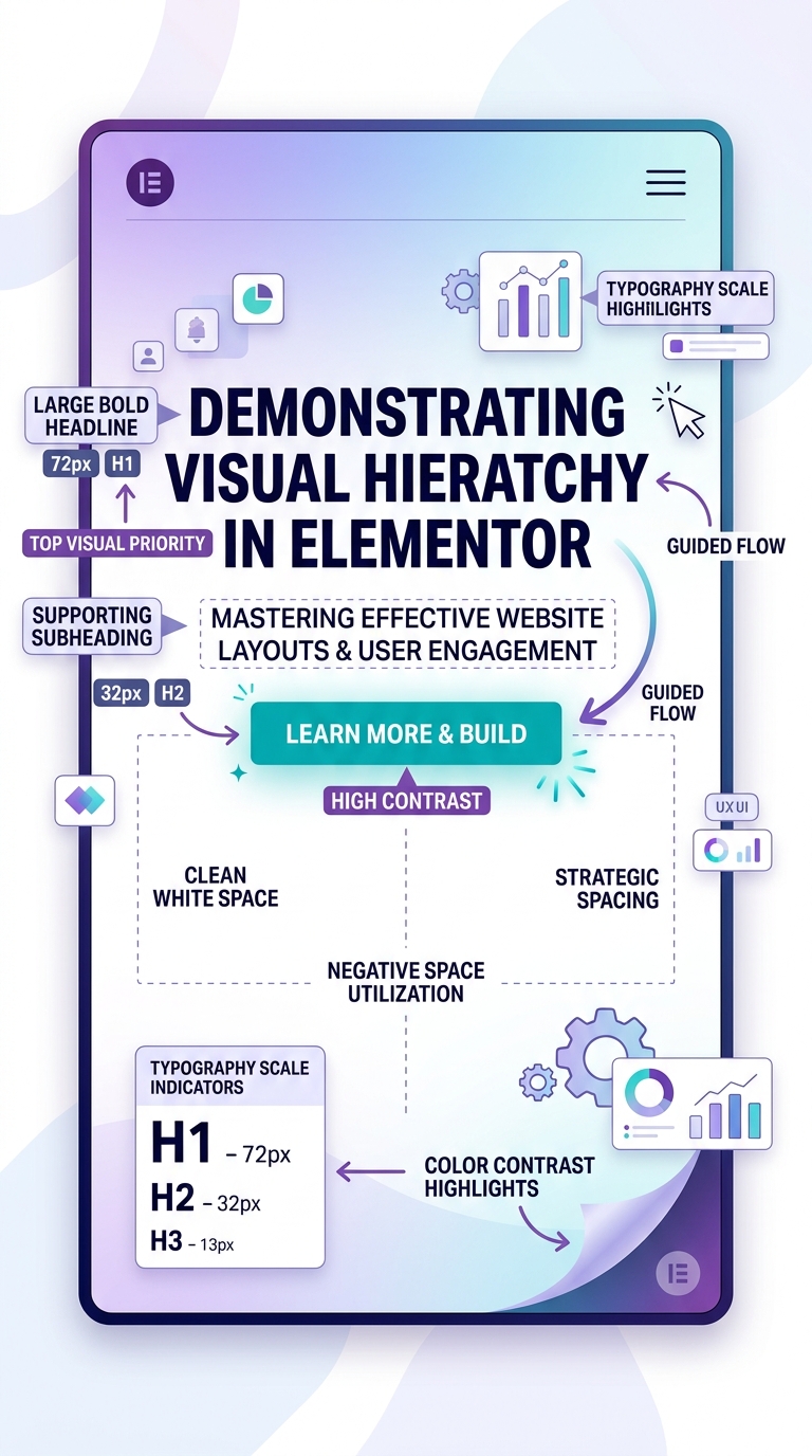
1. Headings Structure (H1 to H6)
Headings visual hierarchy ka base hote hain.
Rules:
- H1 = sirf 1 page per
- H2 = main sections
- H3 = sub-points
Example:
- H1: Visual Hierarchy in Elementor
- H2: What is it?
- H2: Why important?
- H3: Benefits
👉 Headings Google ko structure samjhate hain.
2. Typography (Font Size & Style)
Typography attention control karta hai.
- Large font = important info
- Medium font = normal content
- Bold text = highlight
Example:
- Heading: 32–40px
- Body: 16–18px
- Buttons: bold + uppercase
👉 Good typography = better readability + EEAT boost
3. Color Contrast
Colors user ke focus ko guide karte hain.
- CTA button = bright color (orange/green/blue)
- Background = light neutral
- Important text = highlight color
👉 Example:
“Get Started” button ko standout color dena.
4. Spacing (White Space)
White space ka matlab hai empty space between elements.
Benefits:
- Content clean lagta hai
- User focus improve hota hai
- Premium feel aata hai
👉 EEAT me clean design = trust signal
5. Alignment
Alignment consistency create karta hai.
- Left alignment = blogs ke liye best
- Center alignment = hero section headings
- Proper grid = professional look
Random alignment = amateur design feel
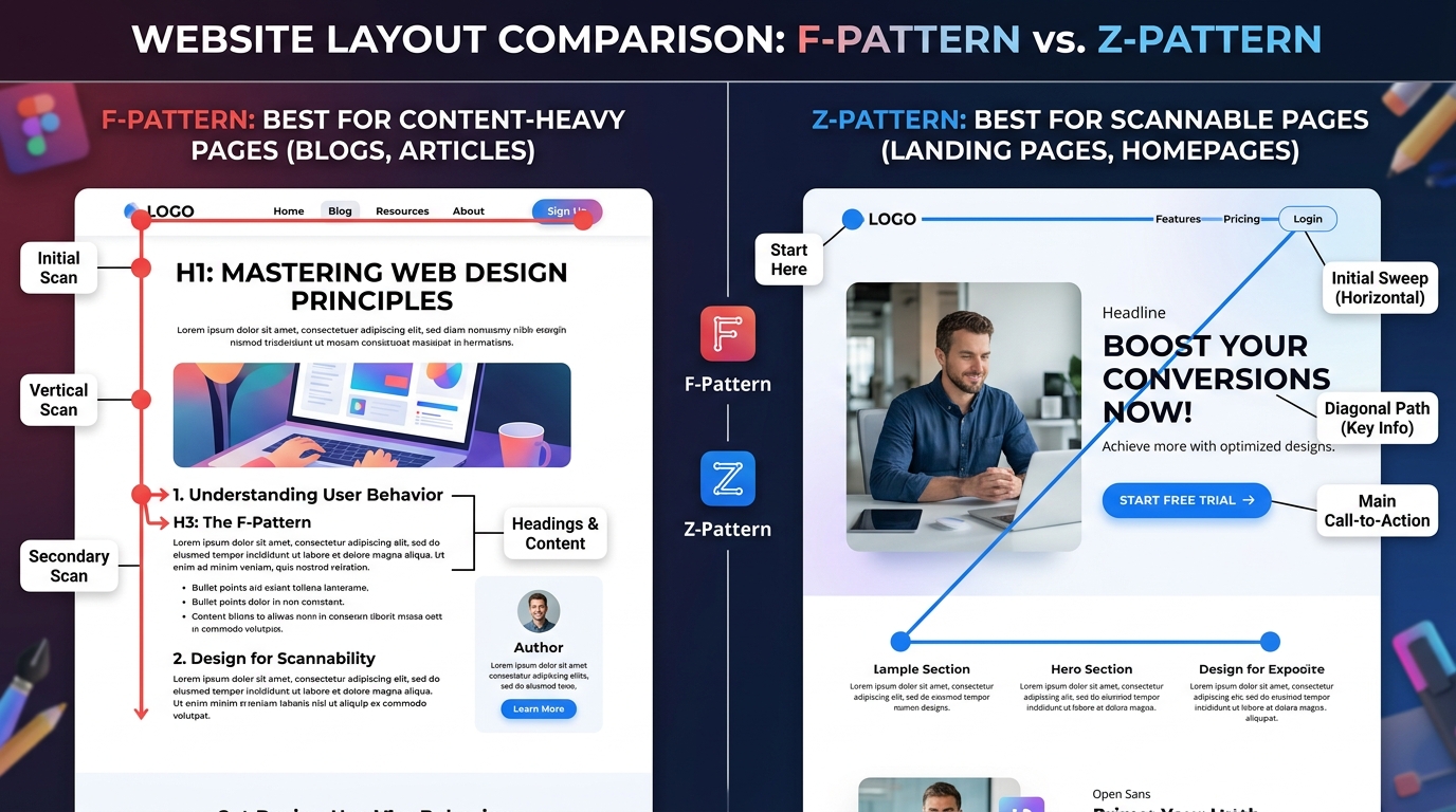
6. Visual Flow (F-pattern / Z-pattern)
Users naturally screen ko scan karte hain:
F-Pattern:
- Blog pages ke liye best
- User top left se start karta hai
Z-Pattern:
- Landing pages ke liye best
- Flow hota hai: headline → image → CTA
👉 Elementor me sections arrange karke ye patterns easily ban jate hain.
🔷 Elementor me Visual Hierarchy ka step-by-step implementation
Step 1: Hero Section design karo
- Strong H1 heading
- Subheading
- CTA button
- Supporting image
Step 2: Sections organize karo
- Problem
- Solution
- Benefits
- Proof (testimonials)
Step 3: Typography fix karo
- Same font family use karo
- Consistent sizes maintain karo
Step 4: Colors decide karo
- Brand colors select karo
- CTA highlight karo
Step 5: Spacing improve karo
- Har section ke beech proper gap do
- Content ko clutter free rakho
🔶 Visual Hierarchy aur SEO connection
Visual hierarchy SEO ko indirectly impact karta hai:
- Better readability
- Lower bounce rate
- Higher engagement time
- Mobile-friendly UX
👉 Google ko signal milta hai ki website user-friendly hai
🔷 EEAT ke according best practices
✔ H1 sirf ek hi use karo
✔ Headings properly structure karo
✔ CTA visible rakho but overuse mat karo
✔ Clean design maintain karo
✔ Mobile optimization check karo
✔ Real examples add karo
🔶 Common mistakes (avoid karo)
❌ Sab text ko bold karna
❌ Multiple H1 use karna
❌ Random colors use karna
❌ No spacing between sections
❌ Too many fonts use karna
Ye sab EEAT ko weak kar dete hain.
🔷 Real Example of Good Visual Hierarchy
Imagine ek landing page:
- Top: H1 + strong headline
- Below: short subheading
- CTA button (bright color)
- Image showing product/service
- Features in H2 sections
- Testimonials
- Final CTA
👉 Ye flow user ko naturally convert karta hai
🔶 Conclusion
Visual hierarchy sirf design technique nahi hai, ye user psychology + SEO strategy + EEAT optimization hai.
Agar aap Elementor me sahi visual hierarchy use karte ho, to:
- Website professional lagti hai
- User trust increase hota hai
- SEO performance improve hoti hai
- Conversion rate better hota hai
EEAT ke according golden rule:
👉 “Simple, structured aur clean design = high trust + better ranking”
-
❓ FAQ: Visual Hierarchy in Elementor (EEAT ke According)
1. Visual hierarchy kya hota hai?
Visual hierarchy ka matlab hota hai website ke elements ko is tarah arrange karna ki user ki nazar automatically sabse important information par jaye, jaise heading → image → CTA.
2. Elementor me visual hierarchy kyun important hai?
Elementor me visual hierarchy isliye important hai kyunki yeh drag-and-drop design ko structured banata hai, jisse website professional, readable aur conversion-friendly lagti hai.
3. EEAT aur visual hierarchy ka kya relation hai?
EEAT (Experience, Expertise, Authoritativeness, Trustworthiness) ko visual hierarchy improve karti hai:
- Clean design = Trust increase
- Structured headings = Expertise signal
- Easy navigation = Better experience
4. Elementor me visual hierarchy kaise banate hain?
- Proper H1, H2, H3 headings use karo
- CTA buttons ko highlight karo
- White space maintain karo
- Colors aur typography consistent rakho
- Sections ko logical order me set karo
5. Kya visual hierarchy SEO ko impact karti hai?
Haan 👍 visual hierarchy SEO ko indirectly improve karti hai:
- Bounce rate kam hota hai
- User engagement badhta hai
- Dwell time increase hota hai
- Google ko better UX signal milta hai
6. Visual hierarchy me sabse common mistakes kya hain?
- Multiple H1 use karna
- Over-bold text use karna
- Random colors use karna
- Spacing ignore karna
- Poor alignment
7. Kya Elementor beginners bhi visual hierarchy sahi bana sakte hain?
Haan, Elementor beginner-friendly hai. Agar aap basic rules follow karo (headings, spacing, CTA placement), to easily professional visual hierarchy bana sakte ho.
8. Best layout pattern kaunsa hota hai?
- F-pattern: Blogs ke liye best
- Z-pattern: Landing pages ke liye best