
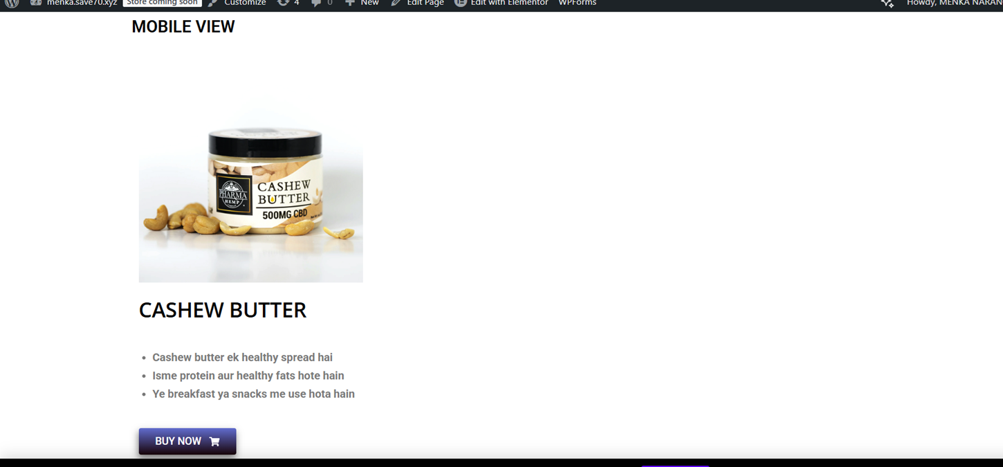
DESKTOP VIEW
Aaj maine Elementor me image + text ka responsive section design karne ki practice ki. Mera main focus tha ki design har device (desktop, tablet, mobile) me properly dikhe.
🔹 Maine kya banaya:
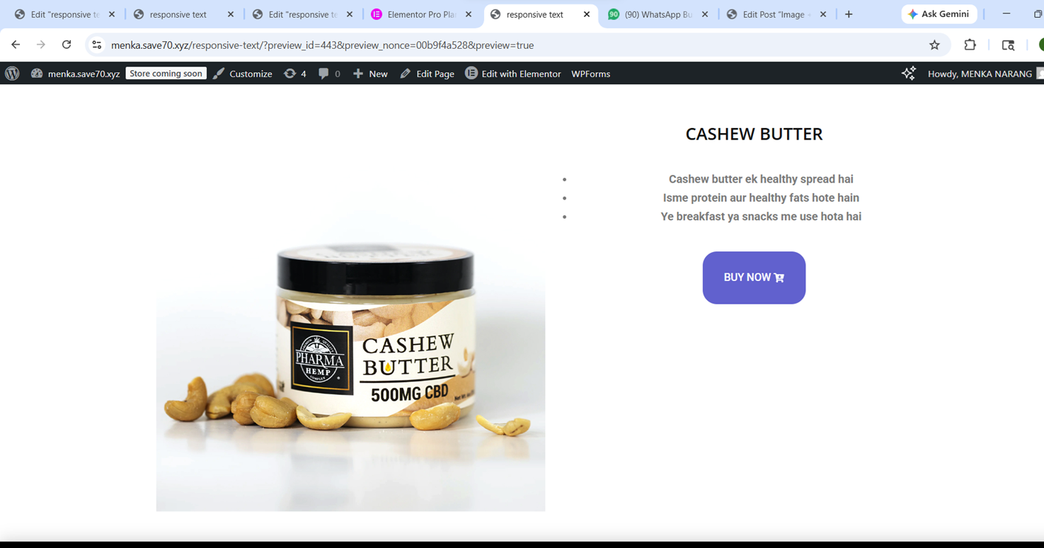
Ek section jisme left side image aur right side text hai
Clean layout with proper spacing
Responsive design jo har screen size me adjust ho
🔹 Maine kaise banaya (Step-by-Step):
1. Container & Structure
Sabse pehle maine container add kiya
Usme 2 columns banaye (image + text)
2. Text Section
Heading add ki
Description likha
Ek button add kiya (BUY NOW)
👉 Alignment ko clean aur readable rakha
3. Image Section
Image add ki
Border radius diya (smooth corners ke liye)
4. Spacing (Margin & Padding)
Padding use kiya content ke andar space ke liye
Margin use kiya elements ke beech gap ke liye
👉 Isse layout balanced aur clean bana
5. Responsive Design (Important Part)
Mobile view me jaake layout check kiya
Text size adjust kiya
Columns ko stack (upar–neeche) kiya
👉 Ab design har device me properly dikh raha hai
Caption likho:
“Desktop view design”
“Mobile responsive view”
🔹 Mera Experience:
Aaj mujhe samaj aaya ki responsive design kitna important hota hai. Sirf desktop design karna enough nahi hota. isko bnane m bohat time laga .baar baar practice karne se muje choti choti chije samjh aayi kese hoti hai .jisse mera confidence bhi boost hua or points b clear hue.
🔹 Challenges:
Mobile view me alignment set karna
Text aur image ka balance maintain karna
🔹 Aaj kya improve hua:
Responsive design ka concept clear hua
Layout control better hua
Confidence increase hua
Aj muje kai chije pta lgi jese agr screenshot lete hai wordpress mai or direct save karke add karte hai toh media m photo to blur aati hai
iske lie kya kre screenshot lene k bad ap paint open kare then (ctrl+v) dbaye usko png mai save kare .
agr fir bhi add karne par blog mai blur hai to ap jo photo add ki hai usko click kare edit ka option hoga waha jakr size full kare then update karskte hai fir aapki ye pronlem solve hojayegi.
💡 Final Thought:
Ek achi website wahi hoti hai jo har device me perfect dikhe. Responsive design ek essential skill hai jo har web designer ko aani chahiye.